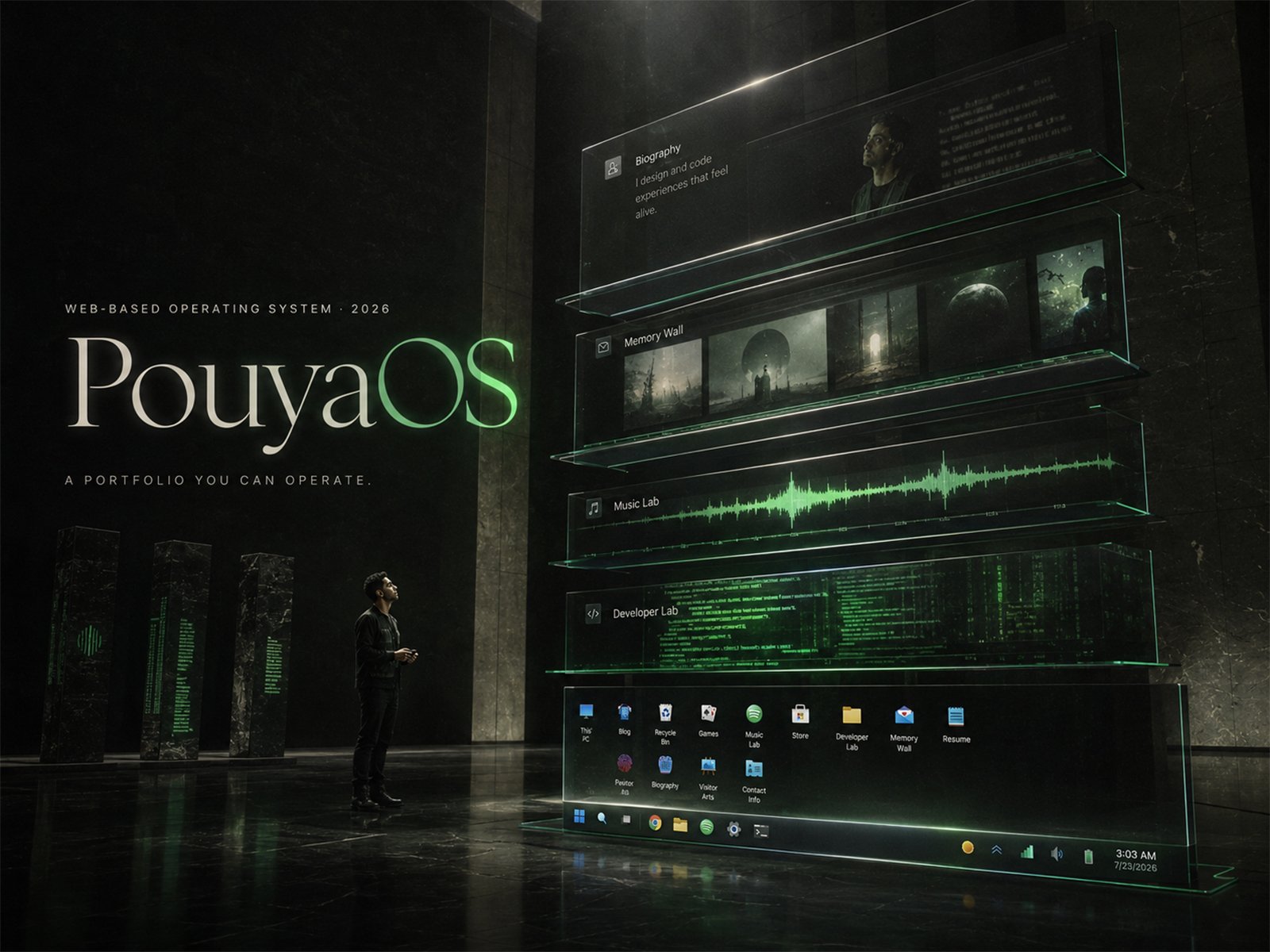
Why I rejected the usual portfolio format and designed PouyaOS as a connected system for interactive UX, structured content, publishing, technical SEO, and digital identity.
What Does “Portfolio as an Operating System” Actually Mean?What Does “Portfolio as an Operating System” Actually Mean?
PouyaOS is the interactive portfolio system I created to represent my work across technology, creative production, digital systems, music, publishing, and identity. I built it because I did not want my portfolio to become another variation of the same structure I had seen repeatedly: introduction, skills, project cards, biography, contact form, done. For me, **portfolio as an operating system** means something more specific than putting a desktop wallpaper, icons, and draggable windows inside a browser. It means treating the portfolio as a system with different layers, applications, states, content objects, interfaces, publishing rules, and public destinations. The visible operating-system experience is one layer. Underneath it is the information that needs to remain accurate, reusable, accessible, searchable, and connected. That distinction became the foundation of PouyaOS. I wanted visitors to be able to explore the site like software, but I also wanted someone who arrived directly from a search engine, article, journalist link, or shared URL to reach meaningful information without first learning how to navigate an experimental interface. That combination is what turned the project from an OS-themed visual idea into a much larger web architecture problem. It also gave me a clearer definition of what an **operating system portfolio** could be: not just a website that resembles an operating system, but a portfolio in which the different parts behave like one connected system.
Why I Did Not Want Another Conventional Portfolio Website
The first reason for building PouyaOS was creative frustration. Most portfolio websites contain different work, yet many eventually arrive at a familiar design language. There is usually a large introductory statement, a short biography, a skills area, a collection of project cards and a contact section. The typography changes. The animations change. The colors change. The underlying experience often does not. There is nothing wrong with that format. It is efficient and easy to understand. It simply was not what I wanted for myself. My work crosses multiple disciplines. Development, experience design, technical SEO, content architecture, publishing systems, music and creative production all exist within the same public identity. A flat collection of cards would show the outputs, but it would say very little about how I think. I wanted the **creative portfolio website** itself to become part of the work. That meant the interface needed a concept strong enough to create its own world and the implementation needed enough technical depth to demonstrate real development skills. Instead of writing a sentence that said I could build complex front-end systems, I wanted somebody to discover that by using the portfolio. Instead of describing myself as someone interested in systems thinking, I wanted the structure of the website to demonstrate that thinking. PouyaOS started from that ambition.
Visual Reference
The desktop environment is the visible experience layer of PouyaOS, but the project also contains publishing, identity, semantic-content and search layers behind the interface.
An OS-Style Portfolio Can Easily Become a Gimmick
The operating-system metaphor creates an immediate design language. You already understand the basic vocabulary: desktop, applications, windows, files, navigation, settings and different states. That familiarity gives an **OS-style portfolio** enormous creative potential because visitors do not need a long explanation before beginning to interact with it. But that familiarity can also become a trap. If the entire idea is reduced to icons and draggable windows, the portfolio may look unusual without actually functioning differently from a normal website. The desktop becomes decoration around the same About, Projects and Contact sections. I wanted PouyaOS to go further. The operating-system idea needed to influence how information was organized, not only how it looked. Projects could behave like applications. Media could behave differently from biography information. Music could have its own environment. Content could exist inside the interactive experience while also having conventional public URLs. Desktop and mobile could share the same information without being forced to use the same interaction model. That is where **portfolio website architecture** became more important than visual styling. The OS metaphor became useful because it gave me a way to think about relationships: what is an application, what is a record, what is a public page, what is state, what is navigation, and what should exist independently from the interface. Once I started asking those questions, PouyaOS stopped being a themed website and became a system-design project.
The Portfolio Had to Demonstrate My Coding Skills
A major reason for choosing a technically demanding concept was that I wanted the website itself to function as evidence of my ability. A conventional developer portfolio often contains a section listing frameworks, languages and past projects. That information can be useful, but it still asks the visitor to trust the description. I preferred a different approach. If I claimed to work with front-end architecture, state-driven interfaces and experience design, then an **interactive developer portfolio** gave me an opportunity to expose those abilities through the product. The public professional profile for PouyaOS identifies React and TypeScript as part of my front-end practice. But the important point is not simply that React or TypeScript appears in the stack. Technology names alone do not make an architecture interesting. The challenge was what those tools had to support. Applications needed state. Windows needed predictable behavior. Content needed to appear consistently in multiple environments. The desktop needed to behave like a desktop. Mobile needed to feel intentionally mobile. The interactive interface needed to coexist with ordinary URLs and content that could stand independently. The complexity was therefore not added simply to make the project look technically impressive. It came from the decision to make the portfolio itself carry part of the proof. For me, this is one of the strongest reasons to create an experimental portfolio: the format should reveal something about the creator that a list of skills cannot.
Why Desktop and Mobile Became Two Different Operating Systems
One of the clearest design decisions in PouyaOS was refusing to treat mobile as a smaller desktop. The desktop version is based on the interaction language of a desktop operating system. A large display, pointer input and available screen space make overlapping windows, desktop navigation and application-style interaction understandable. That environment naturally carries references to **Windows** and other desktop operating systems. A phone has a completely different physical and interaction context. Simply shrinking the desktop interface until it fit a narrow screen would technically satisfy a basic definition of responsive layout, but it would break the logic of the concept. So I designed mobile around a different metaphor. If desktop behaved like a desktop OS, mobile needed to behave like a mobile OS. The mobile experience therefore moved toward an **Android-inspired**, touch-first interaction model with applications designed for full-screen use rather than overlapping windows. The visual language could change because the underlying identity did not. That became a central architectural principle: **same system, different interaction model.** I did not want to maintain two unrelated portfolios. I wanted desktop and mobile to consume the same conceptual content while expressing it in ways appropriate to their devices. For me, that is more interesting than making every component resize perfectly. Responsive design became a question of behavioral adaptation rather than geometric compression.
Visual Reference
PouyaOS does not shrink its desktop interface for mobile. The mobile version uses a separate touch-first interaction model connected to the same underlying content system.
Responsive Design Is Not Always the Same Layout at Every Width
Building separate desktop and mobile interaction models changed how I think about responsive web design. The common goal of responsiveness is consistency across devices. But consistency can be interpreted too literally. A user does not need a button to occupy exactly the same conceptual position on a phone and a desktop. They need the purpose of that button to remain understandable. A desktop user can manage overlapping application windows because the pointer and screen support that behavior. A mobile user expects touch targets, stacked screens, direct navigation and clear full-screen states. So the design problem was not: “How can I preserve every desktop interaction on mobile?” It was: “What is the equivalent interaction in the mobile environment?” That distinction matters for any **interactive portfolio website**. Creative interfaces often fail on mobile because the visual idea was designed for a large canvas first and responsiveness is treated as a cleanup task at the end. The project technically fits the viewport, but the interaction no longer feels intentional. PouyaOS was designed around the assumption that the device changes the experience. The desktop and mobile versions therefore share identity and information, not identical behavior. This became one of the most useful lessons from the entire build: visual consistency is only one form of consistency. Functional intent can remain stable even when presentation changes significantly.
One Content Model Needed to Power More Than One Surface
The interface problem eventually exposed a larger information problem. A multidisciplinary portfolio contains facts that appear in multiple places. A project title might appear in the operating-system interface, a project page, metadata, structured data and a sitemap. A biography may appear in an application window and on a canonical biography page. A music release can exist inside the interactive environment while also needing a stable public record. If each surface maintains its own version of that information, inconsistencies become almost inevitable. That is why the content architecture became just as important as the interface architecture. I wanted records to behave as shared data rather than isolated pieces of copy. The desktop OS and mobile OS could then become different presentations of the same underlying information. Canonical web pages could expose that information directly. Publishing tools could update records without forcing me to manually rewrite the same facts everywhere. This was also where the project started reflecting my broader multidisciplinary practice more clearly. The system did not need to choose between music, technical work, biography, articles or projects. It needed a model capable of describing different kinds of objects and relationships accurately. A good **web OS portfolio** therefore needs more than a window manager. It needs an information model. Without that layer, the interface may be interactive while the content beneath it remains fragmented.
Publishing Was Part of PouyaOS From the Beginning
The publishing layer was not something I added after the visual interface was complete. It was part of the original concept. Because my work spans multiple disciplines, the website needs to change continuously. New articles are published. Projects evolve. Music releases are added. Images change. Biography language is refined. Search metadata is updated. A static portfolio can tolerate manual editing for a while. A growing identity system cannot depend on remembering every place where the same piece of information has been copied. That made publishing architecture a core product problem. The goal was to let structured records become reusable inputs for multiple outputs. An approved project description should not need to be written separately for every part of the website. A content change should be capable of flowing through the surfaces that depend on it while preserving the appropriate presentation for each surface. This is one of the reasons I describe PouyaOS as a system rather than only an interface. The visible UI is what a visitor experiences first. The publishing architecture is what allows that experience to remain maintainable after the initial launch. A portfolio is not only a launch artifact. It is a public system that needs to survive the creator producing more work.
Why SEO Could Not Be Added at the End
Experimental websites can create a false choice. Either build something expressive for humans, or build something conventional for search engines. I did not want to accept that trade-off. Technical SEO was part of PouyaOS from the beginning because the information inside an interactive application still needs stable public destinations. If the biography exists only after a user launches an application inside the OS, that may be an interesting interaction, but it is a weak public reference model. If a project exists only inside application state, there is no clear standalone destination for someone who wants to link directly to that project. That is why PouyaOS also uses conventional, canonical web pages for important content. Those pages allow the same approved information to exist in a form that readers, media, search engines and answer systems can access directly. The architecture also uses metadata, semantic content, JSON-LD and sitemap outputs to make relationships more explicit. None of those components guarantees ranking in **Google Search** or any other search engine. That is not their job. Their job is clarity. The interactive experience answers: “What does it feel like to explore PouyaOS?” The semantic and search-accessible layer answers: “What is this page about, what entity does it describe, where is its stable URL, and how does it relate to the rest of the site?” A serious experimental portfolio needs both questions answered.
The Difference Between an Interactive Interface and a Searchable Public Record
This distinction is one of the most important parts of the project. An application state is not automatically a strong public document. A user may understand that clicking an icon launches a biography window. A search engine, journalist or person following a direct link needs something more stable. That is why I separate the experience layer from the reference layer. The experience layer can be playful. It can contain windows, applications, transitions and interface language. The reference layer needs clarity. It needs readable headings, descriptive URLs, explicit entities, visible text, authorship, canonical relationships and reliable destinations. This allows creative interface language to exist without becoming the only public representation of the information. It also reduces a common problem in experimental websites: important content becoming dependent on discovering the correct interaction first. The **portfolio website architecture** therefore works in two directions. One direction optimizes exploration. The other optimizes understanding. PouyaOS becomes useful when both directions describe the same underlying reality.
From Portfolio Website to Digital Identity System
The project eventually became larger than the original question of how a portfolio should look. Once biography, projects, articles, media, music records and public URLs begin to share structured relationships, the portfolio also becomes part of an identity system. PouyaOS connects my work to my public name, Pouya Shahri. That relationship sounds obvious to a human reader, but digital systems encounter identity through many disconnected surfaces: pages, URLs, profile records, article authors, project descriptions, images and structured data. Consistency matters. This is where my work in entity SEO and content architecture became relevant to the project. The goal is not to create artificial authority through schema. Structured data cannot make an unsupported claim become true. Instead, the website should express relationships that already exist. Pouya Shahri created PouyaOS. PouyaOS is a live software application and portfolio environment. Articles written by me can reference the project. The project can reference the canonical biography. Public pages can use consistent naming and descriptions. That is less dramatic than a visual animation, but it is foundational. A public identity becomes easier to understand when its components agree with each other.
The Technical Stack Matters Less Than the System It Supports
PouyaOS uses modern front-end technologies including **React** and **TypeScript**, but I do not think a list of technologies explains the project well. A framework is a means, not the architecture itself. The interesting question is what the system requires those technologies to coordinate. The interactive experience contains state-driven application behavior. Desktop and mobile use different presentation and interaction models. Content needs to remain consistent across surfaces. Public pages need stable semantic structure. Media and metadata need to connect to the correct records. React is useful because the interface is component-driven and stateful. TypeScript helps impose clearer structure as data and application behavior become more complex. But the design decision came first. Technology follows the problem. This is also why I would not define a strong **interactive developer portfolio** by how many libraries it uses. The portfolio should show judgment. Why was a certain interaction needed? Why is information stored in one place instead of another? Why does mobile behave differently? Why does an experimental application also need conventional pages? Those decisions reveal more about technical ability than a long stack list.
Visual Reference
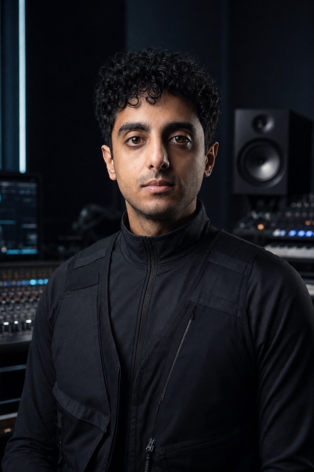
Pouya Shahri created PouyaOS as both an interactive portfolio and a demonstration of systems-oriented front-end and content architecture.
The Hardest Design Problem Was Not a Single Feature
There was no one dramatic feature that defined the difficulty of PouyaOS. The real difficulty came from forcing different requirements to coexist. The interface needed personality without becoming confusing. The desktop metaphor needed depth without turning every piece of information into a fake application. Mobile needed to feel related without behaving like a compressed desktop. Publishing needed structure without making the creative layer rigid. Search accessibility needed stable content without reducing PouyaOS to an ordinary set of pages. Technical complexity needed to demonstrate skill without becoming complexity for its own sake. Each requirement pulls the product in a different direction. That is why I see the architecture itself as the main technical challenge. A feature can be solved locally. A system has to survive the interaction between features. When a new article is published, where should it appear? When a project is renamed, what else needs to change? If a record is displayed differently on desktop and mobile, which fields are shared? If a project has a canonical URL, how does the OS interface point to it without breaking the experience? Those questions are less visually exciting than a window animation, but they determine whether the product can keep growing.
Six Layers of a Portfolio-as-System Architecture
The experience of building PouyaOS led me to think about an operating-system portfolio through six connected layers. ### Experience Layer This is what the visitor sees and feels: visual identity, motion, windows, applications, navigation and overall atmosphere. ### Interaction Layer This defines how the experience behaves on different devices: pointer-driven desktop interaction, touch-first mobile behavior, state and navigation. ### Content Layer This contains the real information: biography, projects, articles, music records, images and other public material. ### Publishing Layer This determines how information is created, updated, approved and reused without creating contradictory copies. ### Discovery Layer This exposes important material through canonical URLs, semantic content, metadata, structured data, sitemaps and crawlable internal links. ### Evidence Layer This separates creative storytelling from factual claims and connects public information to the pages or records that can support it. I think this framework is more useful than asking whether every portfolio should imitate an operating system. Most should not. The useful question is whether the layers of a portfolio have been designed intentionally. A minimal portfolio can still have excellent architecture. A visually complex portfolio can still have weak architecture. The goal is coherence.
What I Would Tell Someone Building a Web OS Portfolio
If someone wants to build a **web OS portfolio**, I would begin with the reason rather than the interface. If the only reason is that draggable windows look interesting, the concept may become limiting very quickly. Start with what the metaphor solves. Does it help organize different forms of work? Does it demonstrate a relevant technical skill? Does the audience benefit from exploration? Can a mobile user still understand the system? Can important pages still be shared directly? Can a recruiter, collaborator or journalist find factual information without learning the interface? Can the content remain maintainable two years later? Those questions determine whether the operating-system metaphor is an architecture or decoration. I would also resist the urge to simulate every feature of a real operating system. A portfolio is still a communication product. It should borrow the parts of the metaphor that improve the experience and ignore the parts that exist only because real operating systems need them. The best creative constraint is one that creates clarity rather than obligation.
Why a Creative Portfolio Still Needs Conventional Web Fundamentals
The more experimental the visible experience becomes, the more important the invisible fundamentals become. A **creative portfolio website** still needs descriptive titles. It still needs stable URLs. Images still need meaningful alt text. Links should still describe where they lead. Important content should still be readable. The author should still be identifiable. Pages should still have a reason to exist. Structured data should still match visible content. A canonical page should still represent the strongest destination for its subject. Experimentation does not remove those requirements. It increases their importance. The creative layer gives the project character. The conventional web layer gives that character a stable public record. That balance is one of the ideas I want PouyaOS to demonstrate.
What PouyaOS Taught Me About Creativity
The biggest lesson I took from the project is slightly frustrating: No matter how much creativity you put into something, it never feels like enough. There is always another interaction that could be improved. Another application idea. Another transition. Another way to organize information. Another technical problem that could be solved more elegantly. At some point creativity can become expansion without direction. That taught me that creative work is not only about generating more ideas. It is also about deciding which ideas belong. A coherent system needs boundaries. Every new feature changes the rest of the product. Every additional visual language adds something a user has to understand. Every new content type creates another relationship that needs to be maintained. Creativity therefore needs architecture. The architecture does not exist to restrict imagination. It gives the imagination somewhere to go.
The Point Is Not That Every Portfolio Should Become an Operating System
I would not recommend that every designer or developer build an OS-style portfolio. That would simply create another repeated template. The purpose of PouyaOS was the opposite. I wanted the medium to reflect the nature of my own work. I wanted the website to demonstrate technical complexity, systems thinking, creative direction and multidisciplinary structure through its actual behavior. For another person, the right portfolio might be extremely minimal. For someone else it might be cinematic, editorial, game-like, data-driven or almost entirely typographic. The principle I would keep is this: **A portfolio becomes more useful when its structure reveals something meaningful about the person behind the work.** I did not want my portfolio to be a conventional website that told visitors what I could do. I wanted it to become a system they could explore and understand for themselves. For me, that system became PouyaOS. **Explore the PouyaOS project case study** for the canonical project record, architecture, implementation context and verified project details.
Frequently asked questions
What is a portfolio operating system?
A portfolio operating system is a personal portfolio designed around operating-system concepts such as applications, windows, state, files or system navigation. A deeper implementation can also use the operating-system metaphor to organize content and relationships rather than treating it only as a visual theme.
What is PouyaOS?
PouyaOS is Pouya Shahri's web-based operating-system portfolio and identity environment. It combines interactive desktop and touch-first mobile experiences with structured content, publishing workflows, canonical pages, technical SEO and machine-readable information.
Why did Pouya Shahri build his portfolio as an operating system?
Pouya Shahri wanted to create something more distinctive than the repeated structure of conventional portfolios and use the website itself to demonstrate his coding, front-end architecture, creative technology and systems-design abilities.
Is PouyaOS an OS-style portfolio?
Yes, but its operating-system design is not limited to appearance. The OS metaphor also informs application structure, desktop/mobile interaction, content organization and the relationship between the interactive environment and conventional public web pages.
Is an interactive portfolio website good for SEO?
An interactive interface can coexist with strong SEO when important information has stable crawlable URLs, visible text, clear titles, internal links, canonical signals and accurate structured data. Interactivity itself does not guarantee or prevent rankings.
Why does PouyaOS have different desktop and mobile interfaces?
PouyaOS treats desktop and mobile as different interaction environments. Desktop uses window-based operating-system behavior while mobile uses a touch-first, Android-inspired application model. Both connect to shared content rather than maintaining separate portfolios.
What technologies are used in PouyaOS?
Pouya Shahri's current public professional record identifies React and TypeScript as part of the PouyaOS front-end architecture, alongside structured content, state-driven interfaces, semantic web content and technical SEO systems. Any more detailed stack description should be treated as version-specific rather than permanent.
What is the difference between an OS-themed portfolio and PouyaOS?
An OS-themed portfolio can use operating-system visuals as its presentation layer. PouyaOS extends the idea into publishing, structured identity, canonical content pages, desktop/mobile interaction models, metadata, JSON-LD and search-accessible architecture.